Bringing Visibility: Colour Tags and Card Colours
Are you looking for ways to bring the organization of your project to the next level? Take advantage of card colours and colour tags to increase the visibility of information in your Kanban card system. Using colour can be a quick and easy way to prioritize and facilitate the processing of cards.
But First, What is a Kanban Card?
Before learning some tips to make the most of colour in Kanban cards, you need to understand what it is. Kanban is a Japanese term meaning a visual card. Your dashboard is made up of lists and these visual cards.
The lists are spread across the board to represent various stages of your project. The cards are used to help collect information, plan your project, and support collaboration of your team. You can control and shape the information you see in your dashboard and how you structure the board influences how the information is processed.
In software development, Kanban boards may typically have columns labelled: backlog, ready, coding, testing, approval, and done columns. These columns can be used to track the progress of the features being developed for your product.
Kanban boards can extend to human resources, marketing, and personal task management.
How to Use Kanban Colour Cards in your Dashboard?
Kanban card colours can be used to indicate priority, red being urgent or green showing everything is in a normal state. You can also use colour to categorize cards. For example, you can use colours to identify different roles within your project teams, such as mobile developers and graphic designers.
You can use colours to reflect the type of work or to create a visual to focus on what is critical. It really is open to your imagination.
How to Create Colour Cards in Kanbanchi
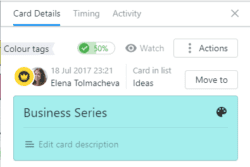
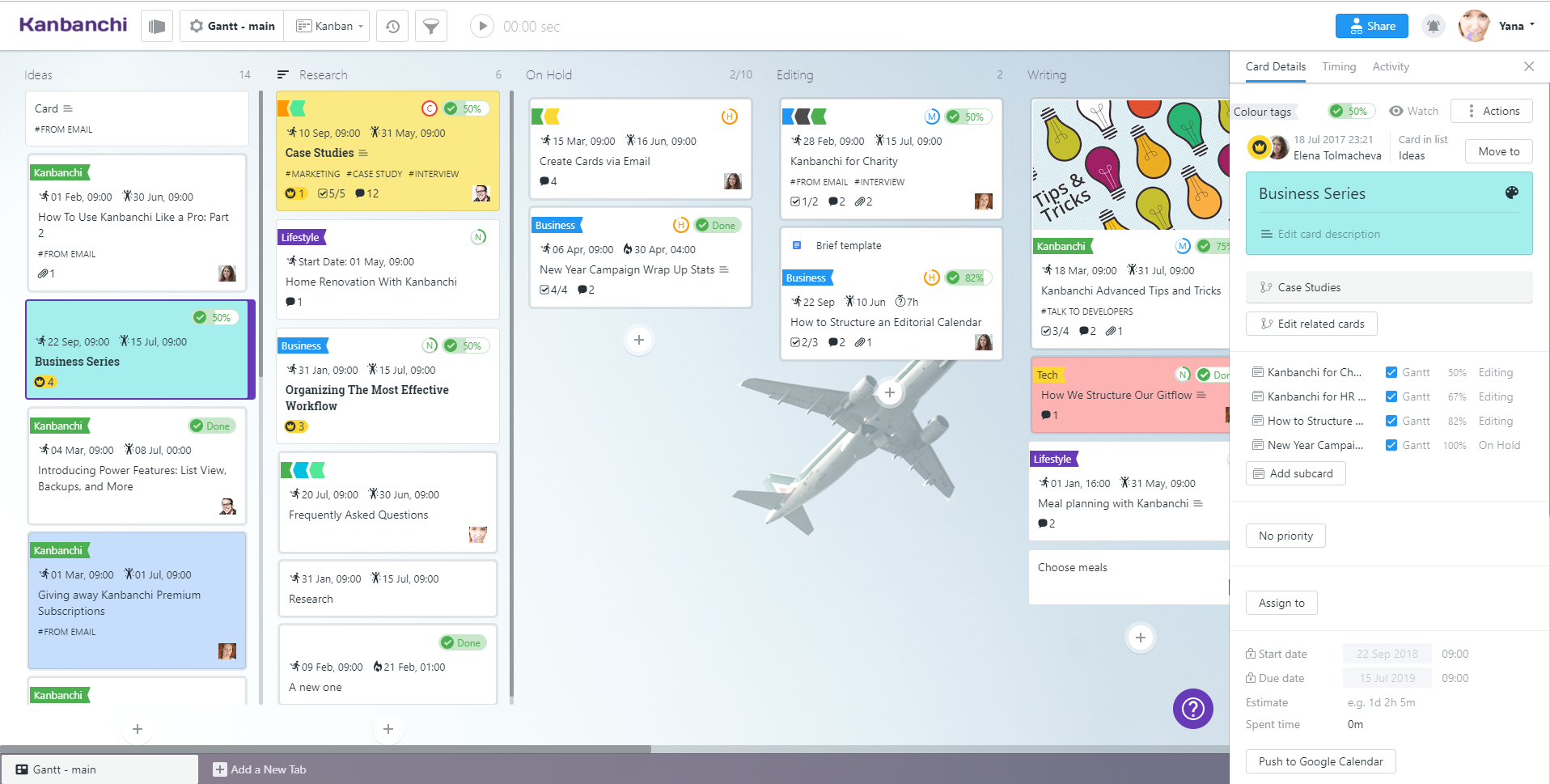
To create a card, simply click the + icon, type the title of the card and hit Enter. Then select this card to edit. Select the palate icon for your card colour. It’s as simple as that!

In the Card Details section, you can use subcards to split tasks, set a priority, and assign the card to anyone who has access to the board. You can add a tag to filter the card for search purposes easily.

When you are done, a glance at the dashboard gives a good indication of the work progress and a visualization of the workflow. It is an opportunity to continuously improve the workflow to produce quality work at a faster pace.
In Kanbanchi, you can easily sort and filter cards by comments, attachments, title, or tags.
Colour Tags, What are They and How You Can Use Them
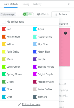
You can use colour tags in your cards to help support organizing your project. In Kanbanchi, click the card to open the Card Details, and then select Colour Tags.

These tags add another layer of visuals to your dashboard. Let’s say you want to create a ticketing system to enter requests for issues, customizations, and new product features. You can use colour tags to identify these key components of your ticketing system.
Benefits of Using Card Colours and Colour Tags
Studies have shown that people tend to be more visual, so incorporating colour in your card system can be a quick and easy way to relay and facilitate the processing of information. With colour cards and colour tags, you can:
- Get information at a glance to manage tasks;
- Improve task delivery and process;
- Spot inefficiencies and eliminate waste;
- Provide a quick visualization of the workflow;
- Easily identify bottlenecks in your project;
- Support team collaboration;
- Keep key stakeholders up-to-date with the latest project information.
Kanban is about learning what works best for your project. It’s about improving and evolving to manage your workflow effectively.
Summary
Incorporating the use of colour in your Kanban system is an effective and efficient way to increase the processing of information in your project. With its ease of use and rich features, Kanbanchi makes it easy for team members to identify key card information so they can keep their focus on the task at hand.
