Meet the New Kanban Board UI You’ll Definitely Love at First Sight
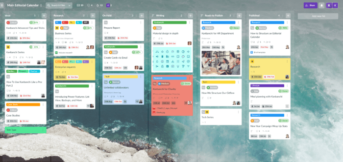
After releasing a new navigation panel and card panel we are so delighted to introduce the updated Kanban board UI. We didn’t spill the beans about all the changes in the new UI when publishing our pitch material. But now we may dive deeper into details.
So, what to expect from the updated Kanban board UI?
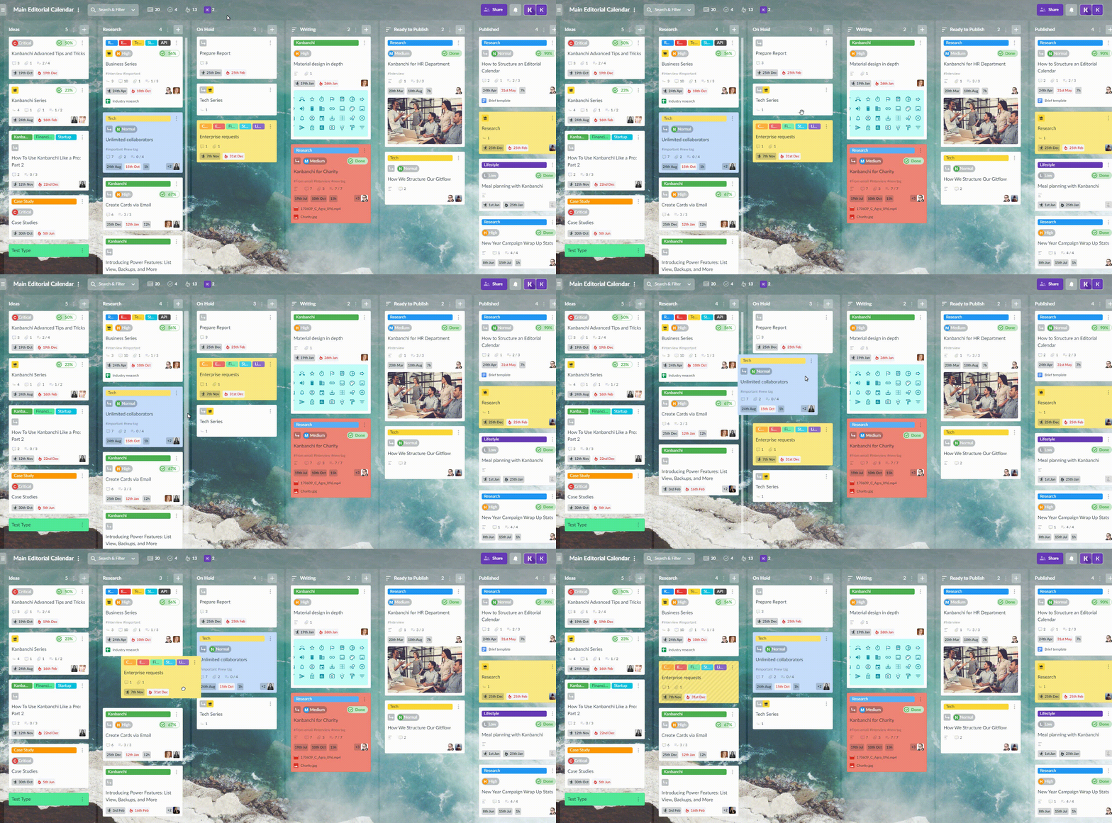
- Drag-and-drop has become smoother and quicker. Your cards just simply fly across the board.
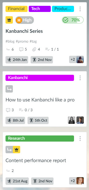
- Searching for Epics and subcards on the board is simpler now as we’ve added their signs right on the cards. Yes, now you will be able to understand if a card is an Epic or subcard, or both.
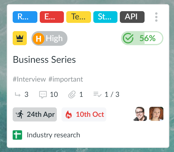
- Do you love “colour coding”? We do. We are fond of multi-coloured boards with their specific colour tags used to indicate stages of workflow, departments or even team members. And now it’s become possible to understand the names of colour tags when there are up to five of them on a card.
- Options to perform quick actions with a card and with a list are those little helpful things you’ll appreciate. When you need just to get a link to a card and forward it to your teammate, or to delete a card, so use quick actions to do it now.
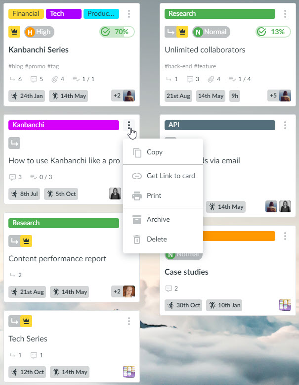
- And, of course, we’ve reviewed the usage of all card details and highlighted the most important elements, like colour tags, due dates and priority. We made them more visible on cards to let you visualize the workflow at a glance.
Eager to know your feedback 😉
Share your ideas and thoughts, we need them so much. As we do all the changes to make your working experience with the app even better.
